The price is right
Let us help you find the best fuel prices

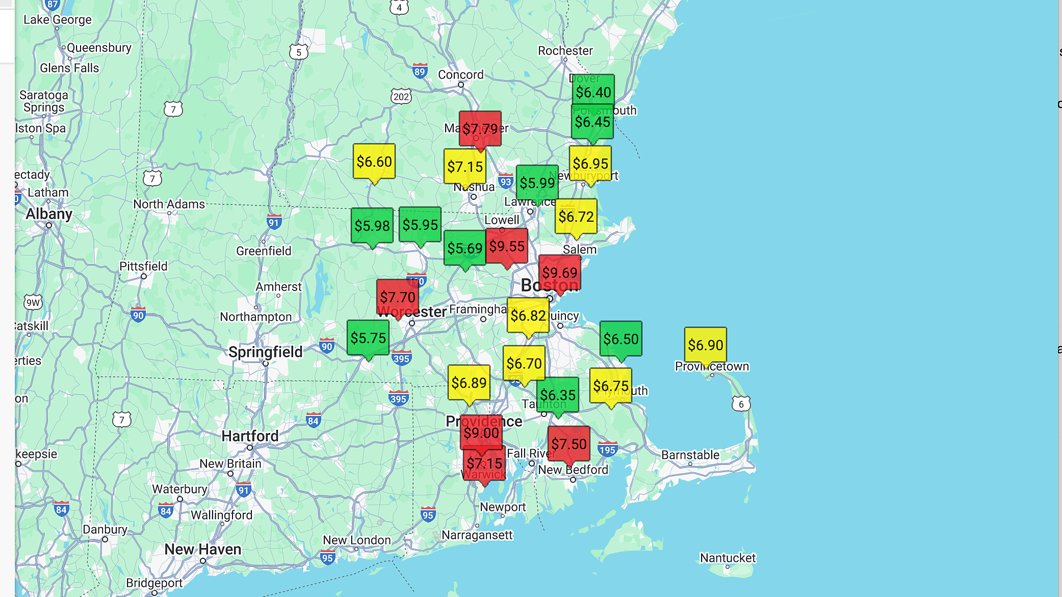
The fuel price map is part of the AOPA Airport Directory. You simply start by searching for an airport ID, name, city, or state and make sure you have the type of fuel selected in the fuel section: 100LL, Jet A, alternatives? Then a map will be displayed showing fuel prices centered around the city you initially searched for. You can drag the map around or zoom in and out to see other areas.
Fuel prices are color-coded based on relative price to those currently shown on the map: Green is the lowest third, yellow the middle third, and red the highest third.
Every time you reposition the map or zoom in or out, the color-coding assignments are reevaluated based on all the prices that are currently in view. The color-coding is dynamic, based on what area you are looking at and how many prices are on the map at that time.
At AOPA we are constantly working to update your membership benefits; in the latest version of our airport directory, the fuel price map is easier to find and more intuitive for users. 

 aopa.org/destinations

